Saturday 23 March 2013

Evaluation Question 7 DRAFT

Looking back at your preliminary task, what do you feel you have learnt in the progression from it to full product?


Looking back on my prelim magazine I feel the weakest of the two components was the contents page, as it was too bare and simple, and wasn't interesting at all. The fact I only included 8 things that were in the magazine wasn't good enough, as since looking at other contents pages and developing my ideas for my new one, I found it is important to write about lots of things that are in there so the readers know exactly what they are buying. Also, even though the letter from the editor is a good idea, when planning my contents for my final magazine, I didn't want to incorporate one due to the style of my contents page, and the simple layout that I wanted to produce. I do feel that I have included relevant information as the topic was a school magazine, and to ensure I did the same with my music magazine, i took inspiration from other magazines such as Q as I could read them, and include certain pieces of information like they do in theirs.
The front cover is simplistic and I wanted to achieve the same look with my final one, however to make my final one better I used the rule of thirds to make the layout more professional, whereas with the prelim, everything is more centred. The bar code is too big, and I also made that mistake on my draft music magazine, as some of the feedback I got was to reduce the size of it. I reduced the size for my final magazine and ensured it was small and tucked away in a corner, so it wouldn't attract attention and distract the reader from the central image of my model.
When taking photos of my models for the prelim I didn't feel like I took enough, as it is important to have a wide range of photos to choose from when selecting them for the cover and contents page, so when completing my music magazine I made sure I took more than I did for the prelim. Also, when taking the photos for my magazine, i used too many conventional poses due to the school magazine area, and with the music genre I wanted to create something more fashionable and colourful, as I felt less restricted making it due to the alternative/indie genre I wanted to explore.

Before creating my draft magazine I completed the research and planning that would have benefited me when designing my school magazine. I found it useful to analyse and look at three different covers, contents pages and double page spreads as this then provided inspiration and ideas for creating my own version. I feel this research was vital as I could see what existing magazines were like and which conventions they adhered to and which they contradicted. I created an audience profile for a typical person who would read my magazine, and this allowed me to create a product that would appeal to the intended audience, due to the fact I kept a specific person in mind, whereas with my prelim I didn't.


My draft magazine was definitely an improvement on my prelim, as I learnt that more had to be included on both the cover and contents, in order to engage and capture the reader and let them know what was inside. However, the contents page felt too busy, as the boxes and images made it look more like a leaflet, and it didn't look like it belonged to the same magazine, along with the cover and double page spread. When completing my double page spread I learnt how important it is to spell check and proof read correctly, as I made simple errors, which i then had to go back and change. 
When cutting the images out for my Preliminary magazine, I didn't spend enough time on them, therefore they look rough around the edges and the background can be seen behind them. I decided I needed to spend more time when cutting images out, so for my final product I spent a few hours perfecting the cover image, as that's the most striking and important image in the magazine - and it looks much better in comparison to my prelim task. 

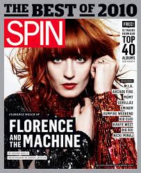
After receiving feedback on my draft magazine I learnt that in order to make the three components look like they're from the same magazine, I had to use a motif or colour scheme that linked them together. To achieve this i looked at other magazines such as Fader and Q as took ideas from their magazines when it came to page numbers and a band of colour across the top. I made sure the contents and cover used the same colours - the deep purple - and then I felt that the double page spread could have it's own colour scheme, due to there being many double page spreads in the magazine not looking the same. I added the 'state - February' to make page numbers as magazines such as Q do this. Having a draft definitely helped due to the improvements given from my teachers and peers. To improve my prelim I could have done a draft in order to get a rough idea to what my final prelim would look like, and I could have then improved it based on received feedback; like I did for my final one.

Spending time choosing outfits for the models to wear definitely improved my magazine, as with the prelim I didn't really take the outfits and make up into consideration. the time spent on styling my artist as well as doing their hair and make up meant that the photos look more professional and like something found in a real magazine.

Overall I've learnt that the longer you spend on cutting images out and correcting things the better the magazine will be, as things can be easily changed and added to make it better. Looking back at my preliminary task, I can see I have learnt what makes a good magazine through looking at other examples and taking ideas from them when creating my own, as no product can start from scratch. I have also learnt that the magazine needs a USP or something original and different to make it stand out from the rest; hence my colourful front cover and specific target audience. 

Friday 22 March 2013

Evaluation Question 6 DRAFT

What have you learnt about technologies from the process of constructing this product?

Throughout my project I have used computers and laptops in order to post things on my blog and research magazines. Computers have been essential due to the use of the internet and software such as photoshop. Without computers I would have had to create a paper portfolio and magazine by hand; which is time consuming and the least effective method of creating a porfolio.

When using Photoshop to create my media package, I used tools that I hadn't used before in order to make the images and layout more effective and professional. When editing the images of my model I used the patch and healing tools to alter the colour of her skin, and to remove any blemishes and spots that were visible. I also used the magic wand tool to remove the background when cutting my model out, as well as the smudge tool to smooth the outline of the hair out and make it more realistic and less cut out. Even though I already had a good knowledge of Photoshop, whilst completing my project I learnt more short cuts such as Ctrl+T which were useful with moving shapes and layers, improving the speed of my work as well as the ease of use. I have also learnt that Photoshop is probably the easiest piece of software to complete a magazine on, due to the easy tools and accessibility that allows the user to import photos, edit them and cut them out professionally - as there aren't many other software alternatives that would allow the user to do the same things.

I used a Camera and tripod when taking my photos and from that I ensured the images were lined up and framed correctly. I also thought it was important that a plain background was used, so I had to incorporate one into my image and find/use a white screen; the images could then be cut out easily, as the outline of the model was clearly visible.

Animoto was used to create my pitch at the beginning of the coursework, and I had never used it before, so I used the simple instructions to create a video using images, text, transitions and music. I liked the overall effect of the video as it took the pressure off when standing at the front, and the components of the video made it exciting and entertaining, capturing the viewers attention and making them understand the concept of my magazine. I think using Animoto was more interesting than using something like a power point  as they're basic and not very professional. Animoto is a good tool as the limited amount of characters allowed on each text post - our brief was to use 25 words in total- means you have to use key words that grab the viewers attention; something a professional presentation would do. 

To create a playlist for my magazine I used Soundcloud, an online music website that allows you to create a mix of songs and upload your own. I had never used this before as I only ever make playlists using iTunes, and creating a playlist on this was new and at first confusing. However, I quickly learnt how to add them all to one place and then use the share button to upload it to blogger, and the widget looks professional and allows the user to listen to all of the songs. Soundcloud allowed me to get a feel for the type of music that would feature in my magazine, and post it on my blog, letting others know the 'indie' style of music that would be featured.

After taking my photos I uploaded them to Flickr in albums, and then shared them on blogger. I have learnt this is a simple way of keeping all of the photos in one place, and also if they get deleted form my memory stick or computer they are in a safe online account that can be accessed anywhere. Also when using Blogger I downloaded the mobile app that allows me to create posts and upload images at any time using my phone, and this makes accessibility easier, as Wi-Fi can be found anywhere.

Blogger was also vital when uploading posts and ideas in the research and planning stages of my magazine, as it allows me to store images and posts containing information that I intended to be helpful. It also allows me to recieve feedback from teachers and peers as they can comment on my posts and tell me what needs to improve, and what works well. It also allows me to post magazie covers I find using google and other websites such as www.coverjunkie.com; which contains a large collection of magazines from all over the world, allowing me to pick the most inspirational covers and use them to base or challenge with my magazine. 

When creating my initial mood board I used www.polyvore.com as the 'create' page lets me import photos and images that I want to use, and then arrange and crop them into whatever shapes I want. This allowed me to use a website I am familiar with to create a post for media, as I then shared the polyvore piece in a post on my blog.

Wednesday 20 March 2013

Evaluation Question 5 DRAFT

How did you attract/address your audience?

When designing my front cover I chose to use a minimalistic style so that the cover image would stand out and catch the readers eye, attracting them to both the magazine and the artist. I have styled my artist almost unconventionally  due to the fact I have not adhered to the male gaze in which the artist is sexualised, as I feel a role model that girls can aspire to, instead of a pin up girl, shows 'new' music artists in a good light. The bright coloured background is unusual due to most covers being either white or grey, and this provides a unique selling point that targets the female 16-24 audience.

The bands and artists mentioned on the cover will also appeal to the audience as they belong to the alternative/indie genre and fit in with the theme of the magazine. If the reader likes finding out about new bands they can look on the front cover or flick to the contents and then read about what's inside, and get a flavour of the different bands and styles of music covered throughout the magazine. The mention of 'Hazel Grace, Touring Fashion and Artefact' draws the reader in as it explains a little about what they can find out by reading the article on Hazel Grace. The mention of fashion would catch the attention of the female readers as they may have interests in the fashion world and want to discover what their favourite music artist wears.  

I have priced the magazine at £4.00 and this would be affordable to 16-24 year old females, as it is monthly therefore they don't have to pay it once a week. Also, many of them would have jobs just like the girl in my audience profile, and therefore be able to spend money on items such as this magazine. The high-end style of the magazine also means the readers get their money's worth, especially since I planned to include around 150-200 pages in the magazine. 

When creating my contents page I included content such as 'read about the nominations...', 'get our exclusive covers sent to your door' and 'say hello to...' as these things address the readers directly and connect with them on a more personal level, instead of being a magazine full of factual and un-interesting information that the reader can't engage with. Also, when writing the double page spread article I designed it so it would be Hazel Grace talking to an interviewer, but it also feels like she is talking to the readers, and answering the questions directly to them, as they are the ones reading about her and making their own opinion on what she is like. 

The lack of coverlines on the front cover of STATE magazine would provoke curiosity in the reader due to the fact they can't automatically see what is inside. The reader can then pick the magazine up and have a more thorough look, instead of being put off instantly by large adverts or strap lines. When gathering research I created an online market research survey and asked my twitter followers to fill it in, as they mostly into indie music and are teenagers in the 16-24 year old category. The majority of my surveyed audience were females and selected indie as their preferred music type, therefore I found that for my magazine to be successful, I would have to cater to these types of people. When asked 'what do you like/not like on the cover of magazines' the audience replied with the following responses: 


From this survey I found that the best way to appeal to my audience would be to make my cover simplistic, and the survey shows they don't enjoy overcrowded pages with too many pictures or too much writing.  
When designing my magazine I found the audience survey helped (see post here: http://hollyarmitagelccw13.blogspot.co.uk/2013/01/market-research-survey.html) as I developed a clear idea of what would attract and appeal to the age group and gender I wanted to aim for. When writing my article for my double page spread, I used ideas and thoughts that the survey provided, as I asked the audience what they like finding out about. 


I used things such as inspiration, upcoming tours and albums, what music they're into and personal stories when writing the interview with Hazel Grace, as I knew these things would be enjoyable to find out about from the point of view of myself as a reader, and the audience, due to the market research. This helped me decide what would appeal and attract the audience, as also what the anchored cover line would be to base the interview on: 'touring, fashion and artefact' - upcoming tours, personal hobbies and likes, new album. 
Once I had completed my draft I then got peer feedback from my peers who are also in the target audience for my magazine. Two of my peers said that the colour palette used was good  as they compliment each other and appeal to the target audience as the front cover is bold due to the purple; which leads me to believe the magazine is eye catching and appeals to the target audience, enticing them to buy my product.

Evaluative Question 4 DRAFT

Who would be the audience for your media product?

A member of the audience for my magazine would be someone like Saskia Rodriguez (Profile: http://hollyarmitagelccw13.blogspot.co.uk/2013/01/reader-profile.html

She is 16 and is completing a-levels in Textiles, Photography and Art as well as socialising with friends and listening to her favourite bands and music artists. She likes finding out about new and upcoming bands as she can then introduce them to her friends, and go and see them in concert. Her favourite indie, less known bands are Imagine Dragons, Wakey!Wakey! and Bastille, although she also enjoys listening to well known, mainstream artists such as Coldplay. Her iPod contains around 2000 songs of all genre's as she is always finding new music on Youtube and through her friends. She spends evenings watching TV in which she finds songs on adverts and uses her iPhone to find the song in order to download it. 

She is part of the 'indie' social group as she enjoys the fashion and music stereotypically associated with the indie style
She also has a Saturday job and earns around £30 per week from her job at a craft shop, and she also earns around £25 from babysitting her neighbours children most weekends. Spends the money she earns on clothes, CD's and magazines. Her favourite clothing stores are TopShop, Vero Moda and River Island. However because of her passion for textiles, she amends clothes her friends no longer want, and often buys clothes from Charity Shops, especially Cancer Research as it's a charity thaty helped her Grandad. She has a Napster account and pays around £10 monthly for unlimited downloads, and she also buys CD's from HMV when she goes into Leicester.
She usually buys magazines such as Q and Clash as they feature information on upcoming bands and have interesting articles on artists she likes. 
She goes to around 3 concerts every year, this year she has seen Two Door Cinema Club and Ed Sheeran, she is also going to Reading Festival this summer with her friends.  

I have aimed my magazine mainly at females, as there is a gap in the market due to the fact most music magazines are either aimed mainly at males, or both genders. Even though males could enjoy reading my magazine, I have created it so it is visually appealing to females, focusing on a role model for teenagers and music they would enjoy finding out about, especially if they fit into the social group of alternative or indie, but have a knowledge or small interest in mainstream alternative artists, such as Bastille and Florence and the Machine.
I originally aimed my magazine at teenage girls, however I feel that females of any age would enjoy this magazine, and aiming it at 16-24 year olds would be more specific and correct, due to the mature style of the magazine, and the lack of 'pop' influence younger teenage girls would enjoy. I have included a role model on the cover of my magazine, as Saskia follows the lives of her favourite celebrities and 16-24 year olds would benefit from a positive influence, as well as an idol who they think is cool. Saskia would be most likely to buy monthly magazines instead of weekly ones, as she likes thicker magazines filled with more articles and images that she can read for a few weeks, instead of smaller, thinner magazines with little content. Also, weekly magazines are harder for her to buy, due to the fact she only goes shopping every few weeks, which is the perfect opportunity to buy a monthly magazine, and not miss out on any issues.

Tuesday 19 March 2013

Evalutation Question 3 DRAFT

What kind of media institution might distribute your media product and why?

Bauer Media group
Originally a small printing house, The Bauer Publishing Group has grown into a worldwide publishing and media company. The Bauer Publishing Group comprises 282 magazines worldwide in 15 countries, as well as TV and radio stations.  

They produce women’s' magazines such as Bella and Take and Break, as well as Q and Kerrang! Two very well-known music magazines and i feel by adding State magazine into their mix they would benefit from the new music genre not previously developed in their other magazines.

Q Magazine was first published in 1986 and it has set itself apart from other magazines due to the higher standards of printing and photography, with an emphasis on style. After using Q magazine for inspiration, i have then developed the conventions found in the magazine to make mine individual.

Bauer Media also has a radio group, and has a 50% stake in Box Television. Channels of the company include 4Music, The box and Smash Hits, therefore by producing a magazine with less known bands inside, they could also link it with the radio and TV stations, playing new music for everyone to hear, as well as read about in my magazine.

I feel that Bauer Media Group would be an ideal institution to publish my magazine, as they are successful and have created two well-known and liked music magazines already, therefore they are trustworthy and people will find out about my magazine due to the publicity and from the fact the customers already enjoy their popular music magazines. Also, by publishing a newer and more indie magazine, the company are targeting more genres and therefore a larger audience, which would result in catering to everyone's likes. 

I am selling my magazine for £4.00 as it is monthly and of a high-end style in comparison to other weekly magazines such as Kerrang! I chose this price as I thought it was similar to other magazines of similar styles, such as Clash magazine and since it is a monthly magazine, and the readers are getting around 150 pages of content, it would be worth the money, and not a weekly payment. I also thought that 16-24 year olds would enjoy buying a monthly magazine for entertainment, using money acquired from their Saturday or even full/part time job. My Magazine could be sold in shops such as WH Smiths as it is a large store that most teenagers go to to buy magazines. Supermarkets such as Morrisons and Tesco, can also stock STATE magazine as they are also places in which magazines are often bought. 

Bauer Media Group also produce apps for Apple that allow the users to read and download a digital copy of the magazine, and this can also be suitable for STATE. Customers can pay for the magazine to read on their phone or tablet instead of carrying the magazine around, and digital multimedia elements like songs and videos can also be included to give the magazine another USP and make it more entertaining and different. The company also offers subscriptions to their magazines, in which the cost is reduced by a certain percentage. With the help of the media company, STATE magazine can set up it's own app so it can be downloaded to an iDevice and read. 

Evaluation Question 2 DRAFT

How does your media product present particular social groups?

I chose to use a female model on the front cover, to represent the female social group as important and iconic, as Hazel Grace is a big artist that people would look up to and admire. I have represented her in a good light, to make her famous for her talent rather than infamous, as I felt it was important to have a positive role model in my magazine, so my audience (teenager-adult females) wouldn't be influenced by a bad role model, found on the cover of gossip magazines, or even other music magazines. I styled my model in such a way that wasn't too edgy; in order to portray a nice attitude, and not a bad reputation that some 'edgy' artists try to uphold.

I think the double page spread adds a fun and quirky element to the artists personality, as the photos on the left hand side show her endearing and outgoing traits. When writing the article on Hazel Grace I wanted to make her sound genuinely lovely and grateful for the support of her friends and family, as I personally feel this is how most artists should behave; instead of being a diva or high-maintenance.

The social group my magazine would appeal to most is the alternative/indie style, as my magazine isn't mainstream due to the fact some of the bands inside the contents aren't well known (such as Spector) and I have also created bands that would be seen as indie. When writing the contents I tried to include different styles of music such as folk so my magazine would appeal to everyone, and veer away from the mainstream expectations of a successful music magazine; due to the fact my targeted social group wouldn't be into that kind of music. I think using small bands with a good reputation shows the social group who listens to them in a good light, as they are more likely to behave properly with positive role models and a good taste in music.


When creating my artist profile I kept Florence Welch in mind due to her famous and incredibly recognizable voice. I also styled my model on her due to her unique vintage clothes that compliment her pale skin and red hair. This split screen shows the influence I took from Florence as the hair styles and facial expressions are similar.


Hazel Grace's outfit was bought in a Charity Shop, and this also ties in with the information given about her in the article; as she buys clothes from charity shops and is quite fashion orientated. The outfit worn by Gigi is from Topshop, a shop that most teenage girls go to in order to find the latest styles and clothes, therefore it appeals to them on a personal level, especially if they shop there regularly.
Hazel's pose is quirky due to the pout and wide eyes, and the teenage audience can relate to this, as when taking photos with their friends, poses like these are often pulled as they're taking jokey and humorous photographs. The style of pose defined by Majorie Ferguson would be comic due to the wide open eyes, 'pulling a face for a real or imaginary audience' as well as invitational due to the emphasis on her eyes, 'mouth shut or with only a hint of a smile', 'suggestive of mischief or mystery, the hint of contact potential rather than sexual promise'.

When creating my contents page I included text about the bands and artists featured in the issue, and I tried to capture the type of music the indie genre includes, such as real bands e.g. Spector, Laura Mvula and Icona Pop, as they're not too well known, yet all have music careers in the charts or alternative scenes. Gigi, another artist included in the contents page has also been displayed as a confident music artist, and can be seen as more sexual in comparison to Hazel Grace, as they are two different music artists. This photo juxtaposes with the cover image of Hazel Grace as Gigi's hair is flowing, and she is wearing a tighter fitting outfit, from an established clothing range, instead of a vintage style dress from a charity shop. These two photos portray different sides of the audience, as they are both different, however I feel like they both give good impressions of the teenage audience, as they are not too provocative or obscene.

The eye contact in both of the photos addresses the reader directly, as we are drawn in by their gaze. These photos feel more personal as we have a link to the artist through the eye contact, making it feel like they're down to earth and care about their fans. Even though not every image on the double page spread includes a pose that uses eye contact, the fun and quirky poses would make Hazel Grace's fans (hopefully) enjoy her as a music artist due to the fact she is exciting and down to earth, like most other 16-24 years olds out there.

Phrases like 'Say Hello to....' are directed at the reader, as they are more personal than simply giving the readers facts that don't grip and engage them. Addressing the reader directly means they can become more involved in the magazine, which potentially means they enjoy reading it more, as they feel like they are a part of the interviews and fan base, surrounding the magazine or artists inside. Also, when writing my article and contents page I used language that would register with 16-24 years olds, as it's not too sophisticated, but it is not slang and shortened words, therefore it is understandable, and fits in the with 'high-end' style magazine I wanted to create.

Evaluation Question 1 DRAFT

In what ways does your media product use, develop or challenge conventions of real media products?

I have adhered to conventions when creating my cover, as I have placed the mast head at the top of the page so it can easily be seen on the shelf, and the audience can recognize the magazine from just seeing the top of it, if it is resting behind others. I have developed the convention of placing the model over the masthead, as not every magazine does this. I feel like I have created a minimalistic cover that focuses on the model, as she is important and a big star that the audience should recognize, and want to buy the magazine just because she is on it.
Minimalistic covers are a convention used by Clash magazine, and when creating my magazine I took inspiration from their style. I have also taken the idea of having a model with read hair on the cover, as it makes the model exciting and the image striking - catching the audiences eye.
I have also used writing that stands out against the background, which is a convention of magazines, as the audience needs to be able to read what is inside the magazine. I chose the font Bebas Neue for my mast head as it is bold as stands out against the purple background. I have then also used Everafter for the anchored text on my front cover, as it is different and quirky, like the text on the front of Clash Magazine.
Also sticking with the theme of Clash's colour palette, I have used a purple background for my front cover that compliments the outfit that the model is wearing to make my magazine look modern and fashionable, as well as adhering to the vintage theme I set at the beginning of my project. I found that most magazines adhere to a three colour palette, and when designing mine I chose to use white, purple and the pink featured in the models outfit.
I have addressed the rule of thirds and I have centered the model, as well as writing in both of the outer thirds. This makes the magazine looks professional, as well as allowing it to be minimalistic, as Clash magazine often does this. The fonts also ensure the reader can see what's inside as the font makes the writing easy to read and simple.
A stereotypical contents page is busy, filled with what's inside and images of new and well-liked bands, however I didn't want to adhere to this style as I feel it's too busy. When completing my contents page I took inspiration from this contents page from Fader magazine, as it is simple and clear; it uses one main image and then has only two columns of writing. When completing mine I chose to use three columns of text so less white space is visible, and i have included two photos, one of my cover model and one of the artist 'Gigi' to include more detail into my contents. I have included more information on the contents page to show the readers what else is inside which is a convention of other contents pages from magazines like Q.
However I feel I have challenged conventions of straight columns on the contents page by using centered text and three central columns it makes the layout more simple and shows the white background more, making the text stand out - yet whilst it is symmetrical.  
I have also added some variety in my magazine by using two different images that don't look similar, to show the different artists in the same music genre, and this conforms to conventions as magazines display the best artists no matter what they look like.

The left hand side of my double page spread challenges conventions as usually one photo is used of the artist or band, and this fills the whole A4 side; however with my magazine I chose to create a photo montage that has been done before by magazines such as allure (Zooey Deschanel http://hollyarmitagelccw13.blogspot.co.uk/2013/01/possible-layoutidea-for-photos-of-model.html) to add a quirky feel to the artist and the magazine itself. I think because this style of double page spread is different to others out there, it provides a fun and exciting feel.
I have also used the interview technique which is used in most magazines to tell the audience about the artist, from the artist themselves. I have laid the interview out in two columns instead of the conventional three to create a simpler layout and to ensure the text can be easily read. I used font size 9 in order to write the most amount of words that would fit onto the page, as this means the interview is more in depth and the audience can find everything they need to in the interview. Upon my audience research I found out what kinds of information the readers like to find out when reading an article, and I then included them when writing the interview. I have included information on the artist such as stories from touring, where they've come from, where they get their inspiration from and who their influences are.
I have also created an album cover as the conventional magazine element of having an album to promote in the magazine is both visually aesthetic and also gives more depth to the artist and their background/career.

I chose to use medium close up's of my model to display her face/torso as that is one conventional pose used within magazines. Another convention is a mid-shot however I didn't want to show that much of her body on the front cover, as I wanted the image to focus on her striking features (eyes, hair). I used a mid shot on my contents of 'Gigi' as I wanted to vary the images and have the two models in different poses, as to have everyone in the same pose wouldn't look right and isn't a typical convention of a magazine. I also wanted to portray the idea the two artists are different, as female artists are often compared to eachother. By giving them both a different style and a different pose, it shows how their personalities and careers are disimilar. The outfits are different also, as one dress was bought in a charity shop, and the other from Topshop and both look different on the models. Hazel Grace is wearing outfits inspired by casual themes and music artists such as Florence Welch, whereas Gigi is wearing a playsuit that can be classed as more fashionable as modern music artists wear similar clothes.

Wednesday 6 March 2013

Changes to my Double Page Spread


I have made a few changes to my double page spread including correcting the typo in the pull out quote and adding credit for the writer and photographer who's names i have made up. I have also made the text smaller so it is now font size 9 and i have added more questions to make the interview longer and more in depth, as a response to my feedback. 
I have also changed the font of my title and i have removed the quote that was underneath as it looked too busy. I debated making the subtitle smaller however, i feel that a title on it's own is bold and stands out more. Also, because she is an established artist i didn't feel like i had to write anything cheesy such as "Hazel Grace reveals all" as her interview would explain everything. I have used the same font as the one used for my page number to keep the themes and styles consistent throughout the magazine. 

Sunday 3 March 2013

Styling my model (2)

When styling my second model i used the same theme of vintage clothes in order for the photo to look like it fits in the magazine. 
I used styling inspiration from Nina Dobrev and wanted to style 'Gigi' in a simple, subtle way using natural make up and flowing hair. I used these images when styling her hair and i chose an outfit similar to the denim playsuits and went for a minimal look in terms of accessories, with only a small belt.

I also took some other photos whilst she was wearing a similar dress to Hazel Grace, however i chose not to use a photo of her with that outfit as it looked too similar too the front cover image, and i think she looked nicer wearing the blue playsuit.