
I like the right hand page better than the left, at the images are structured and mainly parallel, not collaged - however, i think the collage suits the magazine style.
The title of 'Contents' isn't very large, and the images stand out more, however it is clear that these are the contents pages because of the text explaining about the reviews, articles that relate to the front cover's stories and regular writers/ features of the magazine.
There are images of singers and band members that relate to the headers and articles they are promoting, which attracts the reader to a particular article, as they know it includes and artist etc that they enjoy. The contents page also gives the readers a chance to subscribe to the magazine if they like it, which is also a common feature for most magazines.

I like the bold title of 'Contents' on this page, as the font style is dark in comparison to the rest of the page, and this creates a focal point, letting readers know what page it is. Images are placed on the page in places where they are easily seen, and page numbers relating to articles about the artist are also shown using coloured bubbles that make the page more colourful and exciting.
I like the list of what's in the magazine as it's easy to read, and it's also broken up by the blue and pink tabs on the page. A larger title of 'Free music downloads' grabs the reader as by reading and buying this magazine, they can get more out of it, courtesy of the article.
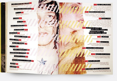
I like the unique layout of this contents page from Dazed and Confused as it's unconventional and simple. The reader is instantly drawn to the images in the middle, and the text surrounding the images show what's inside the magazine and the page numbers.
The black sticker tape effect works well in contrast to the pale images and background, as it creates an edgy/arty feel. There are also small pieces of writing explaining the headers which allow the reader to find out more about a certain article or feature of the magazine. The font for this writing is similar to handwriting, adding to the uniqueness of the contents page.
The two images of the artists/models on the page splits the text up and makes it easier to read as it is in two distinct columns; which also allows the photo's to be big enough to see and look at closely, much like the usual image on the front cover of a magazine.
No comments:
Post a Comment