
There are no clear thirds used, however the piece of text at the bottom is off centre, but is placed on her neck so it is visible and easy to read. Not having adhered to the rule of thirds, this makes the arty image stand out, and make it seem like a piece of artwork, not a magazine - which means it's unique.
This photo suggests we are seeing her through the male gaze as her lips are slightly parted, adding to the sexual nature of the actress.
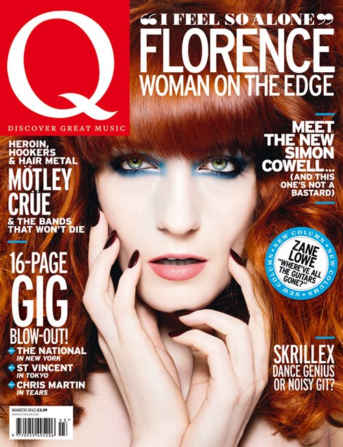
The main colours used on this cover are Red, White and blue, as Florence's hair fills up most of the background, due to the fact the photo used is a close up. I like this as it provides an alternative base colour, and the white writing stands out from the page. I like how the writing frames her face and how the title 'Q' only takes up one corner, and text about what the issue contains and the star on the front is easier to see because it is bigger.
The writing is set in the rule of third position, as it frames her face, a puff is used in the right hand third and it draws the attention to it due to the blue contrasting with the white text.
The piece of writing anchored to Florence says "i feel so alone" and this makes the reader feel sorry for her, but also we want to find out her story and understand why she is alone.
The magazine also tells the reader what else they can find in the magzine, which adds to the appeal of buying it, if they like bands or artists also mentioned on the cover. The different pieces of text on the front cover are separated by several blue lines, that tie in with the singers make up, and the puff used to market Zane Lowe. This breaks the text up more and makes it easier to read, and it also structures the page so it is neat and not messy, and the audience doesn't think there's "too much going on".
The bar code is small and doesn't attract attention, as the eye is drawn to the image and the text.

The main body of text is in the left hand third and the large plus side draws the reader in as it stands out against the background.
The masthead is covered by her hair, which doesn't matter due to the fact the magazine is well known and established, therefore readers can recognize it from only a few letters.
'How she writes pop hits' is displayed next to the image and this draws the reader in as aspiring artists may gain hints and tips for the future, or fans of Lady Gaga want to know she she works and writes her songs.
No comments:
Post a Comment