Showing posts with label Magazine Cover. Show all posts
Monday, 29 April 2013
FINAL FRONT COVER
FINAL FRONT COVER:
I have made no extra changes from my last upload: http://hollyarmitagelccw13.blogspot.co.uk/2013/02/changes-to-my-front-cover.html
However, i have finished cutting out my model using photoshop and i have edited the image, in order to place it on the cover of my magazine and make it look professional and celebrity-like. I have also used the smudge tool to make the shape of her hair more natural, as i found it difficult to cut her hair out without it looking odd.
I like the overall image as the white font stands out against the purple background, and the image is clear and the shirt the model is wearing ties in the with background and they compliment eachother making the magazine look smart and classy.
Sunday, 28 April 2013
Saturday, 23 February 2013
Changes to my front cover
I have made a few changes to my front cover based on the feedback i received from my peers and teachers.
I have removed the 'In this Issue' and 'Win tickets to see Three Blind Mice' from the cover as feedback told me they didn't fit with the style of magazine i am going for.
I think the decision to remove them is the right one, due to the fact 'In this issue' is stating the obvious, as if bands are written on the front cover it is clear they will be inside the magazine. Also, i don't feel i have to entice the reader into buying the magazine with 'free' things or competitions, as i have set it up so the cover star - Hazel Grace - will make people want to read it as she is well known and a respected artist people would want to read about.
I have chosen to stick with the simple layout i originally decided on as it links to the high-end, more professional market i am pitching the magazine at, as well as the price of it and the audience. Even though the design is somewhat unconventional due to the small amounts of text, it still adheres to the rule of thirds and is eye-catching. I have made the bar code smaller and less obvious too, as i was told it was too distracting and took the focus away from the image of my model.
I need to cut out the image of Hazel Grace again as her hair was too jagged and it wasn't professional enough, but i will place it in the same position so it overlaps the title 'State'
Tuesday, 12 February 2013
Styling my Model
I chose three different outfits for my model to try, and then selected the best photos from each of the outfits to use for the cover, contents and double page spread. I took inspiration mainly from Florence Welch, as she also has bright hair; as my model has ginger hair. The dresses in this post are not really that similar to the one 'Hazel Grace' wears in the photo, however they do contain some of the same colours, and shapes/cuts.
I chose a pale blue shirt (top left) as her eyes were also blue, and a pale top would mean her features and hair stood out more. I also thought i could use a darker shade of blue for the background of my cover, so the image and clothing would stand out. I paired the shirt with a pair of skinny jeans, however did not take photos of them due to my vision of having a medium/close up on the cover. I used a photo
I also chose a darker blue and white striped shirt that, like the paler blue one, ensured her features and hair would stand out. I liked this shirt better than the other one, as it was darker and had a pattern to it, therefore it was more interesting to look at and work with.
The purple dress worked really well and i eventually used a photo on both my cover and contents page. I thought it worked well with her hair up as it looked classic and the hairstyle is also seen as being indie. I like the way it blended in with the dark purple background of my front cover as well, as i felt the image wouldn't have looked as good with a contrasting background.
Friday, 8 February 2013
Completed Mock
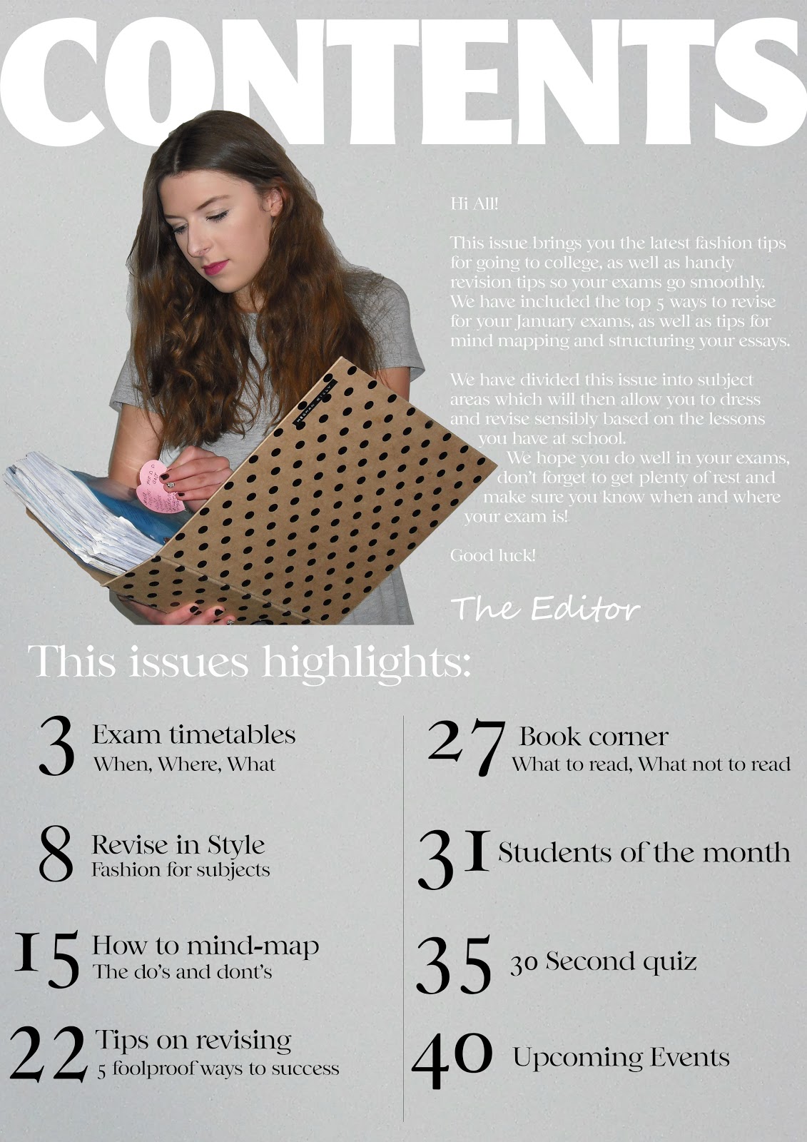
I have completed my front cover, contents and double page spread using Photoshop and i have included photo's of my cover model as well as photo's i've taken at festivals and of friends in the past.
I like the basic front cover as Clash's influence means it's simple and not overcrowded with fonts and pictures of other artists, which ties in with the data collected from my audience survey; as they said they liked covers that weren't too busy.
I also like the purple background and how it compliments the outfit "Hazel Grace" is wearing as i took idea from my past cover attempts and stuck with a matching colour scheme, not a contrasting one. I like the font (i have used 'Ever After') as it reminds me of fonts used for book titles such as The Great Gatsby - old, vintage and show-like, which ties in with my theme.
If i could improve the contents page i would add more writing and quotes that would give the reader more information of what they would find on which page, as i feel it's too bare and not in enough detail to engage and entice the reader; however, i feel the 'subscribe today' in the bottom right hand corner stands out and draws the reader in, as they might like to find out about subscribing to the magazine.
I have added things to the magazine that the audience who participated in the survey said they would like to see, as this means it would appeal to the target market. I have added things such as reviews and concerts/gigs as these were specifically asked for by the survey participators.
For my double page spread i have used the gradient tool for the background, as it looks like a professional magazine and adds depth to the page. However, i'm not sure that the blue text is bold enough for it to be easy to read, but i have used the same colour for the quote at the beginning; as it has been taken from Hazel Grace's shirt.
When designing the left hand page of my double page spread i styled in in the same way as the Zooey Deschanel Allure shoot, which many other magazines and models have done too. I think it works well, however i am going to wait for feedback before deciding on whether i am going to use the same layout for my final version.
Tuesday, 5 February 2013
Mock Magazine Photos
Holly Armitage's photostream on Flickr.
Taken 04/02/13Photos for the front cover, contents and double page spread.
(One possibility for the final Magazine)
Thursday, 31 January 2013
Artist Profile
Name: Hazel Grace
Influences: Kate Bush, Fanfarlo, 'Almost Everything I wish I'd said the last time I saw you' by Wakey!Wakey!, 'Lungs' by Florence and The Machine.
Album: Her debut album 'Where the arches used to be' came 2nd in the charts on the week of it's release. Her second album comes out in April.
Her voice has often been compared to Birdy and Gabrielle Aplin's.
Cover star:
Light make up, natural, basic foundation, subtle eye make-up, lipstick.
Either flowing hair or pinned up, vintage 20's style.
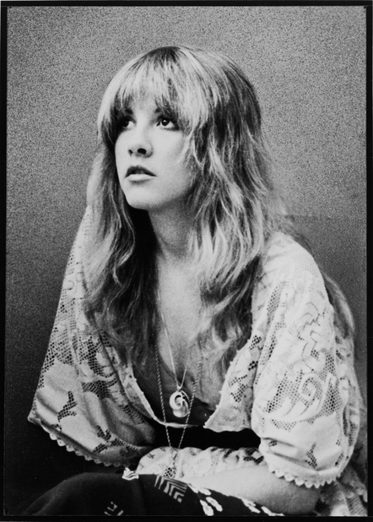
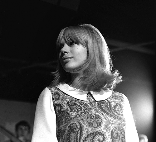
Floral/vintage style clothes - her fashion inspiration comes from Stevie Nicks, Marrianne Faithfull and Pattie Boyd.
Likes shopping in charity shops as that's where she started with her wardrobe as a young teenager.
-
With this magazine i have used contrasting colours as the green background doesn't relate to the models clothes or make-up, and i like the bright colours working together.
I have cut the cover star (Dianna Agron) out and then overlayed her onto the mast head, which means part of it is hidden. I like this effect as most well-known magazines do it due to their popularity, as everyone can recognise the magazine from the font used. I also like the black contents in the right hand third, as it stands out more than the white font on the STATE cover staring Lady Gaga. However the 'Follow' from 'Follow the Horizon' doesn't stand out enough due to the shadowing of the image.
When completing my real magazine cover I will need to ensure the text is bold and can be easily read, as the cover page is what the reader first looks at, as they judge whether to buy it, or even pick it up.
Tuesday, 29 January 2013
Friday, 25 January 2013
-
I have based this magazine on Clash and have attempted to use the two tone affect by using the pink background to match Lady Gaga's pink hair.
I like the simple list of contents on the right hand side and i like the name 'State' for my final music magazine as it has connotations of 'Statement' and adds a bold element to the cover.
However, after receiving feedback from an Online survey i found people thought there wasn't enough content in the left hand third, and the text on the white was too faint.
Thursday, 24 January 2013
CLASH COVERS
I like these covers because they're stylish and simple, and they use coloured background that compliemtn the image of the artist on the front. The artists images are close ups, and i love the white font that tells the readers what's in the issue. The list is classic and small, making the magazine look high-end and it also creates the vintage/classic look i want to portray in my magazine.
The magazine covers adhere to the rule of thirds, however the small amounts of text on some covers means it is more simplistic and not crowded, which is essentially what i want STATE magazine to look like.
I like the mast head and how it stands out but is still white, due to the fact the letters are bold and thick. The barcode is smaller and thinner, therefore less obvious on the front cover, and the proce and issue number are displayed underneath.
I like the use of an achored title, as 'Bombshell' and 'Soul Bearer' are catchy, and the font is unique and stands out as it is used on every cover, giving Clash magazine an individual style.
The close up of the model on the cover is also breaking conventions as usually a Mid-Shot is used, and this is why i like the cover, as it is more fashionable and model, and stands out against other magazines coveres, because of both the fonts, models and covers.
The colours are also toned and pale, yet some coveres feature contrasting colours that are bold and bright in comparison to the others.
Wednesday, 23 January 2013
Music Magazine step by step:

I have used this image of Florence Welch from Florence and the machine, as it is a natural pose that reveals something about her personality,
The Header text type is Franklin Gothic and the other text on the page is font type Freehand575 BT. I have chosen the masthead font as Franklin Gothic as it uses thick lines to create a bold title that can be seen easily against the pale background. I have then used a handwriting type font to add to Florence's natural picture, and make the magazine more vintage/quirky.
Subscribe to:
Posts (Atom)