Showing posts with label Research. Show all posts

Wednesday, 13 February 2013

Evaluation of Research

From looking at different magazine covers, contents and double page spreads i found what style and type of magazine i wanted to create, due to personal preference, and which layouts i thought were most eye catching and nice to look at, therefore more appealing to the public. I also analysed clash magazine as a whole, and i then chose to base my magazine on a similar layout to that one, as i thought it was professional and simple. I also took background ideas from Clash and experimented with contrasting and similar colours, as i then discovered what each style looked like. For my mock magazine i chose to use a similar colour scheme, so the models outfit would tie in with the background but still stand out from it. 

I originally created a vintage themed mood board, but have since then developed my magazine into something a bit more indie, to suit the target audience, as i found from the survey the genres most commonly listened to are indie and alternative. I still kept elements of the vintage theme when choosing outfits for my models, as i also included this influence in my magazine pitch, and the feedback for that was successful. 


On this post i have analysed the results from the survey i asked my friends and followers on twitter to fill in. As an overall evaluation, i have taken what they have said into consideration when designing my mock magazine, and i will keep their comments in mind when adjusting and improving it, as well as feedback i get from Mr Ford and Miss Abrahamson. 
I discovered the survey audience didn't like crowded front 
covers but wanted to know what they could find inside the magazine. When reading interviews within the magazine they said they wanted to know about personal experience, influences, touring and recording albums etc, and when writing my interview with Hazel Grace i tried to incorporate as many of these things as i could to make it interesting and appealing to the reader. 
I also noted that the readers like posters in magazines as most teenagers (my target audience) like to put stuff on the walls on their room. I created the left hand side of my double page spread so that readers could rip it out, without there being any writing or pull out quotes covering the images, as they might not have wanted that on their wall. 

Thursday, 24 January 2013

CLASH COVERS


I like these covers because they're stylish and simple, and they use coloured background that compliemtn the image of the artist on the front. The artists images are close ups, and i love the white font that tells the readers what's in the issue. The list is classic and small, making the magazine look high-end and it also creates the vintage/classic look i want to portray in my magazine.

The magazine covers adhere to the rule of thirds, however the small amounts of text on some covers means it is more simplistic and not crowded, which is essentially what i want STATE magazine to look like.
I like the mast head and how it stands out but is still white, due to the fact the letters are bold and thick. The barcode is smaller and thinner, therefore less obvious on the front cover, and the proce and issue number are displayed underneath.
I like the use of an achored title, as 'Bombshell' and 'Soul Bearer' are catchy, and the font is unique and stands out as it is used on every cover, giving Clash magazine an individual style.
The close up of the model on the cover is also breaking conventions as usually a Mid-Shot is used, and this is why i like the cover, as it is more fashionable and model, and stands out against other magazines coveres, because of both the fonts, models and covers.
The colours are also toned and pale, yet some coveres feature contrasting colours that are bold and bright in comparison to the others.

Examples of double page spreads:

This double page spread features a large A4 image of the singers on one side, and the article on the other. A large title runs along the bottom as it relates to both pages, and the white and black fonts have been used to stand out against the background and photo.
'Sing out Sisters' uses alliteration and makes the title stick in the readers head; it is also short and sharp, giving the reader an overview of the singers. 
A caption of the photo has also been used on the left hand side, to explain who the singers are and what they're called. 
The article itself is set in clear columns that makes the format of the page easy to see. There are also inset photo's that have been used to break the page of text up, they also give the reader more information about the band, as well as something to look at other than reading the text. A colourful dropcap has also been used as the 'I' in the blue square shows clearly where the article starts. 
I like the simple layout of the pages, as the columns of the article make it look professional and also means it's easy to read, which means the audience will enjoy it more. The large photo also gives the reader something to either cut out and keep, or look at as the read the article.
The sisters have been shot in a natural pose, adn we can see they have not been viewed throught the Male Gaze, as they are younger and less mature than celebrities such as Scarlett Johansson. It also adds to the style of their singing, as they're sisters it's clear they're united and together all the time.

 
The large USA behind the image of Florence is eye catching and subtle, as it is only a few shades darker than the background, but it makes a statement about the article. The title, 'Got the Love' links to one of her songs, and fans of her music will already be enjoying the article. A small introduction has also been used, which may explain to the reader what the article is about, as well as giving extra information about the artist. A dropcap that matches the title font has been used to make the article look professional, and also it adds to the layout of the page as the readers know where the article starts. 
The article is then written in columns that are easy to read and look professional opposite the cut out image of Florence. Her black outfit matches the black title, and the red flag stands out due to the monotone background and colour palette of the page.
I like this double page article because there is a clear contrast between the dull and bright colours, and i think it is laid out professionally, and i would find it easy to read. 
Florence is sitting in quite a seductive way, as you can see her legs, and we begin to view her through the Male Gaze as the high heeled shoes and pose make her look like a sexy woman that men would prefer to look at. However, her style and look is also idealised by females, as they would want the sex appeal and look of Florence.


This double page spread features an A4 picture on the right hand side, and columns of text are on the left. A large pull out quote has been displayed over the double page spread, which reads 'I could be playing to 15,000 people at Madison Square Garden and i'd stil have a chip on my shoulder'; and this makes the readers want to find out why he would and what he is on about.
The article has been written in columns and the pull out quote separates the text and makes it easier to read.
The use of the red quote also adds colour to the page, and ties in with the colthing the artist is wearing. This adds to the colour scheme and adds an element of brightness in comparison to the black, white and grey tones on the page.
The member of the band pictured on the right hasn't been photographed in a usual studio location as the background of the photo seems like he is standing on an old car, adding to the edgy look of both the band and the style of the article. His pose has connotations of Elvis Presley (Jailhouse Rock) and this emphasizes his love for music, and possibly his inspiration for his career and life.

Tuesday, 22 January 2013

Example of Contents Pages:

I like this contents page, as it is spread over two pages, meaning it is less cluttered, and more images and text can be used to show the readers what is inside the magazine.
I like the right hand page better than the left, at the images are structured and mainly parallel, not collaged - however, i think the collage suits the magazine style. 
The title of 'Contents' isn't very large, and the images stand out more, however it is clear that these are the contents pages because of the text explaining about the reviews, articles that relate to the front cover's stories and regular writers/ features of the magazine. 
There are images of singers and band members that relate to the headers and articles they are promoting, which attracts the reader to a particular article, as they know it includes and artist etc that they enjoy. The contents page also gives the readers a chance to subscribe to the magazine if they like it, which is also a common feature for most magazines. 


I like the bold title of 'Contents' on this page, as the font style is dark in comparison to the rest of the page, and this creates a focal point, letting readers know what page it is. Images are placed on the page in places where they are easily seen, and page numbers relating to articles about the artist are also shown using coloured bubbles that make the page more colourful and exciting. 
I like the list of what's in the magazine as it's easy to read, and it's also broken up by the blue and pink tabs on the page. A larger title of 'Free music downloads' grabs the reader as by reading and buying this magazine, they can get more out of it, courtesy of the article.


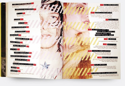
I like the unique layout of this contents page from Dazed and Confused as it's unconventional and simple. The reader is instantly drawn to the images in the middle, and the text surrounding the images show what's inside the magazine and the page numbers. 
The black sticker tape effect works well in contrast to the pale images and background, as it creates an edgy/arty feel. There are also small pieces of writing explaining the headers which allow the reader to find out more about a certain article or feature of the magazine. The font for this writing is similar to handwriting, adding to the uniqueness of the contents page. 
The two images of the artists/models on the page splits the text up and makes it easier to read as it is in two distinct columns; which also allows the photo's to be big enough to see and look at closely, much like the usual image on the front cover of a magazine. 


Friday, 18 January 2013

Examples of Magazine Covers

This cover is bold and bright due to the colors used, the limited amount of text on the cover means the focus is on Scarlett Johansson, in the style of Andy Warhol's work. By using a white masthead that isn't parallel to the image, or the text which adds to the artistic feel of the cover. I like this cover because it is unusual and the image is only of her face, not a mid shot like most other magazines.
There are no clear thirds used, however the piece of text at the bottom is off centre, but is placed on her neck so it is visible and easy to read. Not having adhered to the rule of thirds, this makes the arty image stand out, and make it seem like a piece of artwork, not a magazine - which means it's unique.
This photo suggests we are seeing her through the male gaze as her lips are slightly parted, adding to the sexual nature of the actress.

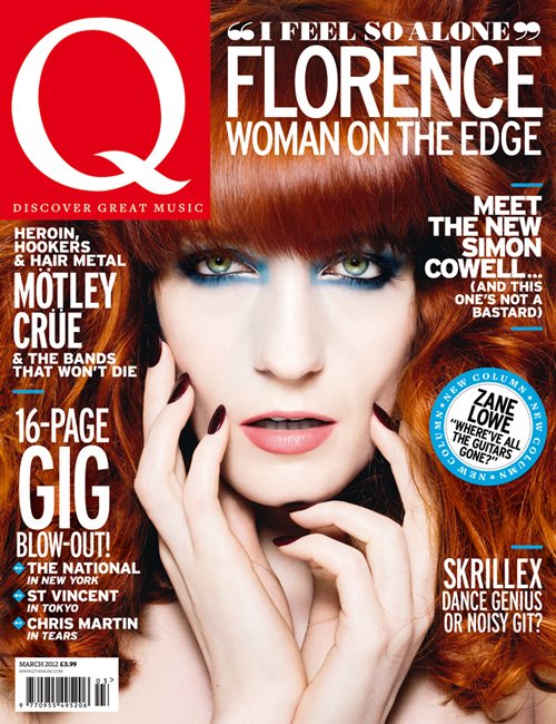
The main colours used on this cover are Red, White and blue, as Florence's hair fills up most of the background, due to the fact the photo used is a close up. I like this as it provides an alternative base colour, and the white writing stands out from the page. I like how the writing frames her face and how the title 'Q' only takes up one corner, and text about what the issue contains and the star on the front is easier to see because it is bigger.
The writing is set in the rule of third position, as it frames her face, a puff is used in the right hand third and it draws the attention to it due to the blue contrasting with the white text.
The piece of writing anchored to Florence says "i feel so alone" and this makes the reader feel sorry for her, but also we want to find out her story and understand why she is alone.
The magazine also tells the reader what else they can find in the magzine, which adds to the appeal of buying it, if they like bands or artists also mentioned on the cover. The different pieces of text on the front cover are separated by several blue lines, that tie in with the singers make up, and the puff used to market Zane Lowe. This breaks the text up more and makes it easier to read, and it also structures the page so it is neat and not messy, and the audience doesn't think there's "too much going on". 
The bar code is small and doesn't attract attention, as the eye is drawn to the image and the text.


The image of Lady Gaga stands out against the pale writing and grey background, as her hair is brightly coloured and has been placed over part of the masthead. I like the small amount of text that seems to be in the background in comparison, and i like this as it makes the image stand out even more, it almost looks 3D.
The main body of text is in the left hand third and the large plus side draws the reader in as it stands out against the background.
The masthead is covered by her hair, which doesn't matter due to the fact the magazine is well known and established, therefore readers can recognize it from only a few letters.
'How she writes pop hits' is displayed next to the image and this draws the reader in as aspiring artists may gain hints and tips for the future, or fans of Lady Gaga want to know she she works and writes her songs.